Restaurant Ratings Visualizer
Written in Python
Visualization of predicted restaurant ratings using machine learning and the Yelp academic dataset. I created this project in Spring 2019, while I was studying at Mt. San Antonio College, using UC Berkeley’s Spring 2019 CS 61A skeleton code.
Features
Some functionality included in this restaurant ratings visualizer include:
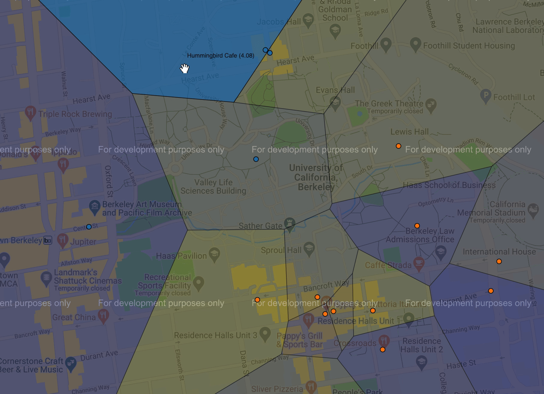
- Restaurant visualization of a Voronoi diagram showing Berkeley segmented into regions:
- Each region is shaded by the predicted rating of the closest restaurant.
- Each dot represents a restaurant, where the color of the dot is determined by its location.
- Unsupervised learning using k-means algorithm to group data points into clusters
- Supervised learning using simple least-squares linear regression to predict what rating a user would give for a restaurant.
Preview
In this preview, I will be generating a visualization for my own ratings which is in a file called jesnine.dat:
make_user(
    'Jesnine Erillo',      # name
    [                   # reviews
        make_review('Crossroads', 1.0),
        make_review("D'Yar", 4.5),
        make_review("Gypsy's Trattoria Italiano", 3.0),
        make_review('La Burrita', 4.0),
        make_review('Mandarin House', 3.0),
        make_review('Quickly', 2.0),
        make_review('Subway', 1.0),
        make_review('Top Dog', 4.0),
    ]
)
Below is a preview of the visualization generated by running:
python3 recommend.py -u jesnine -k 2 -p -q 'Coffee & Tea`
This will predict the ratings of Coffee & Tea places for the user jesnine with kluster size 2.